Online Community Branding: The Basics You Can’t Skip
Branding your online community is more than just slapping your logo on a homepage. Your brand isn’t just a visual element—it’s the personality that defines how your members feel when they engage with you. A clear, consistent brand identity sets the tone for interactions, reinforces your ethos, and shapes the culture of the community.
Whether you’re launching a new community or refining your current one, getting the basics of branding right makes all the difference in member engagement. Here’s what matters most in building a strong community brand.
Visual community brand elements
The visual elements of your community are the immediate bridge connecting it to your larger brand identity. They help create a seamless experience for customers transitioning from your main site or product to the community, reinforcing trust and brand recognition at every touchpoint.
Logo
Your community logo should closely align with your company’s main logo, whether it’s an exact match or a well-thought-out variation. This ensures instant recognition and strengthens your overall brand identity. By incorporating key elements like icons, fonts, or visual styles, you maintain brand cohesion and equity. Keep the logo simple, memorable, and reflective of your community’s purpose. It should be consistently visible on every page within your community to reinforce your branding at all touchpoints.
Color palette
Stick with the colors your customers already know from your main brand’s palette. Whether they’ve seen them on your website, emails, or ads, these familiar colors create a cohesive experience and reinforce trust when carried into your community.
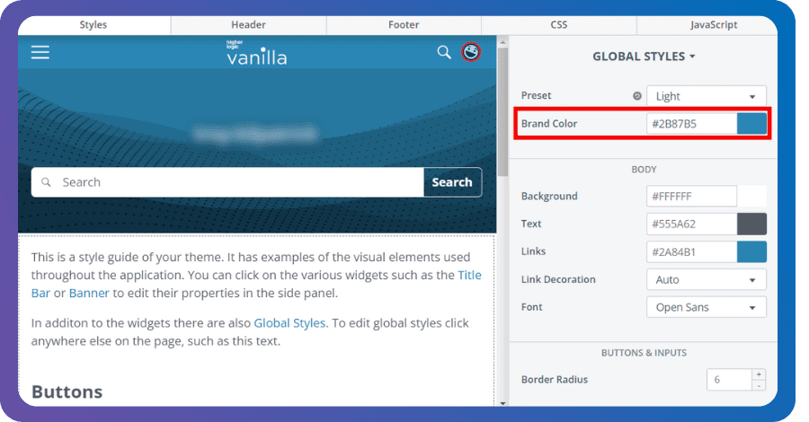
Ensure that your color palette is applied consistently across your community and all communication materials. Vanilla’s global styling guide simplifies this by letting you set a single brand color that’s automatically applied to multiple elements, like background, text, and links, ensuring a cohesive look without added effort. But if you want more control, you can get as granular as you need. Whether you prefer to keep it simple or customize each element, Vanilla offers the flexibility to manage your community’s branding to fit your vision.

Typography
Typography plays a subtle but important role in creating a polished and cohesive experience. Your community’s fonts should mirror those used in your broader brand. With Vanilla, you have the flexibility to choose from preloaded fonts or set a custom font using web-font services like Google Fonts or Adobe Fonts, or even host your own fonts for complete control.
Imagery and design style
The photos, icons, and emojis you use further reinforce your brand’s identity. If your brand leans toward modern and minimalistic, your community’s design should echo that. Likewise, if your company’s imagery focuses on human connection or vibrant visuals, these should also be reflected in your community’s content to maintain a unified look and feel.
Non-visual community brand elements
Visual branding sets the stage, but it’s the non-visual elements that give your brand depth, personality, and emotional connection. These aspects of branding influence how your community members interact and engage with the platform.
Brand voice
Your community’s tone should match your brand’s voice. If your brand has a professional, no-nonsense voice, your community’s discussions and content should reflect that same formality. If your brand leans more casual and friendly, the community’s conversations should follow suit.
The goal is consistency. Wherever users interact with your brand—whether in the community or anywhere else—they should get the same tone and personality. Keep in mind, how your community communicates sets the stage for member engagement and participation.
Core messaging
Your messaging should reflect the mission and values of your community. Use the same key messages your brand emphasizes across other channels, but tailor them to fit the context of the community. This might include highlighting the role the community plays in enhancing customer experience or underscoring the value of collaboration and shared knowledge among members. The community should serve as a meaningful extension of your broader brand story.
Member interactions
How your members interact with each other is also part of your brand identity. Establishing community guidelines that reflect your brand’s values reinforces the brand identity customers already know and trust.
Bring your brand to life with Vanilla’s Layout Editor
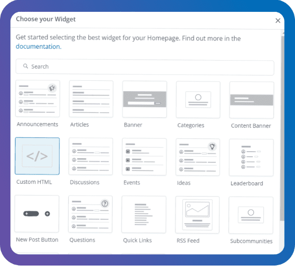
Once you’ve nailed down your brand’s voice and tone, it’s time to bring it to life in your community. Vanilla’s Layout Editor makes that easy. Without needing developers, you can drag and drop widgets to build pages that feel like a natural extension of your brand. Whether it’s quick links, user spotlights, or popular tags, the widget library gives you the flexibility to design layouts that align with your style.

Plus, you can use dynamic widgets to personalize content for different user segments. New members get onboarding resources, top contributors see tools just for them, and developers can access technical docs. You keep the experience relevant and engaging, no matter who’s interacting with your community.
6 Key Places to Infuse Your Brand Into Your Online Community
We’ve covered the basics of branding your online community—now it’s time to bring those concepts to life. In the next post, we’ll guide you through the most impactful areas to integrate your brand, along with practical tips for adding personal touches that make your community uniquely yours.
Discover six ways to brand your online community, and build an experience that’s instantly recognizable and fully aligned with your brand identity.

